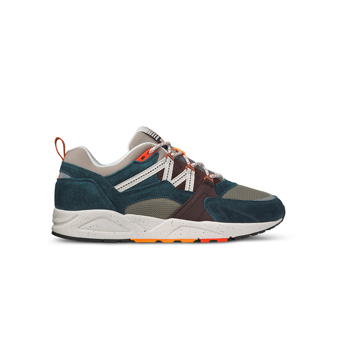
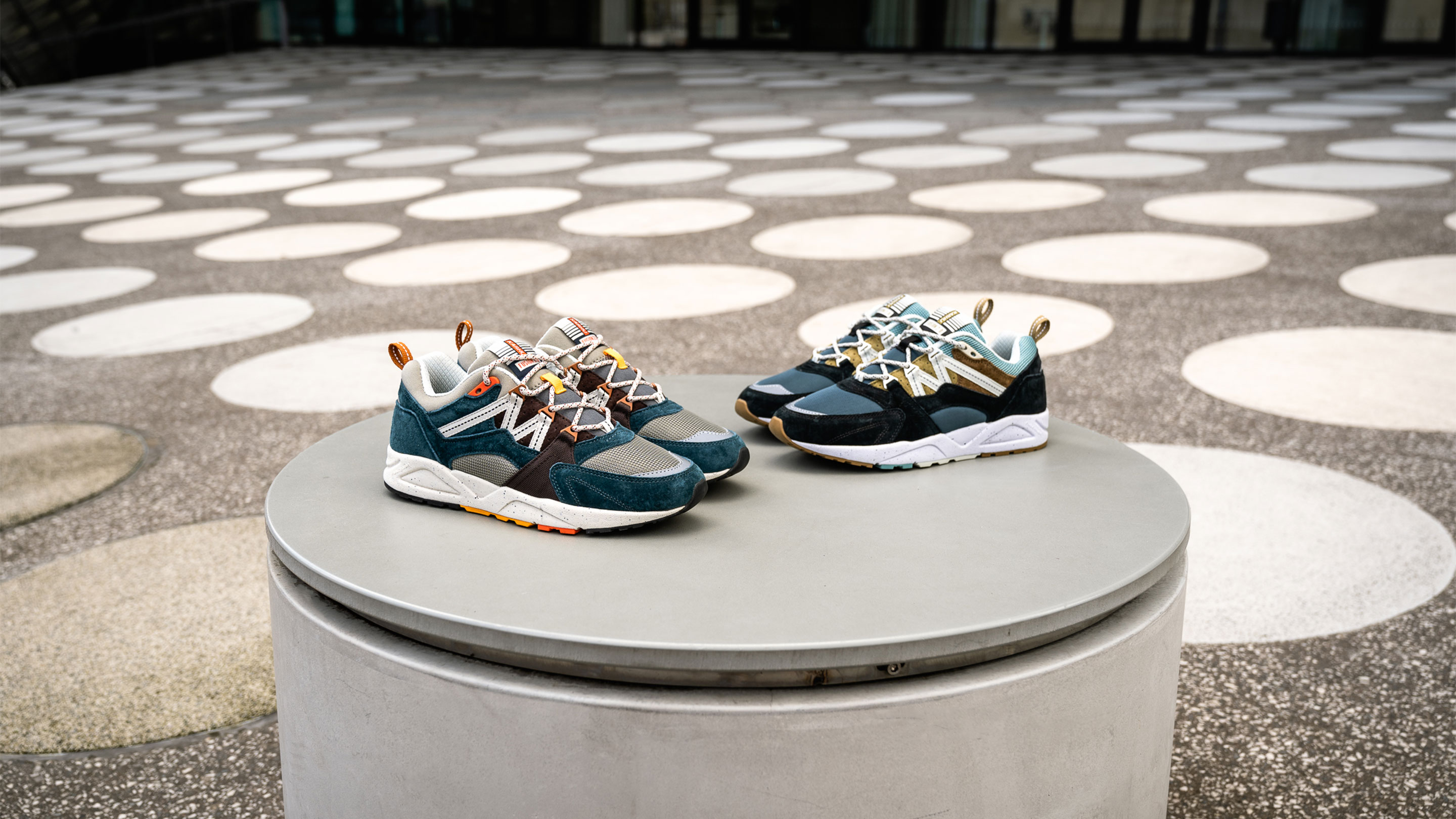
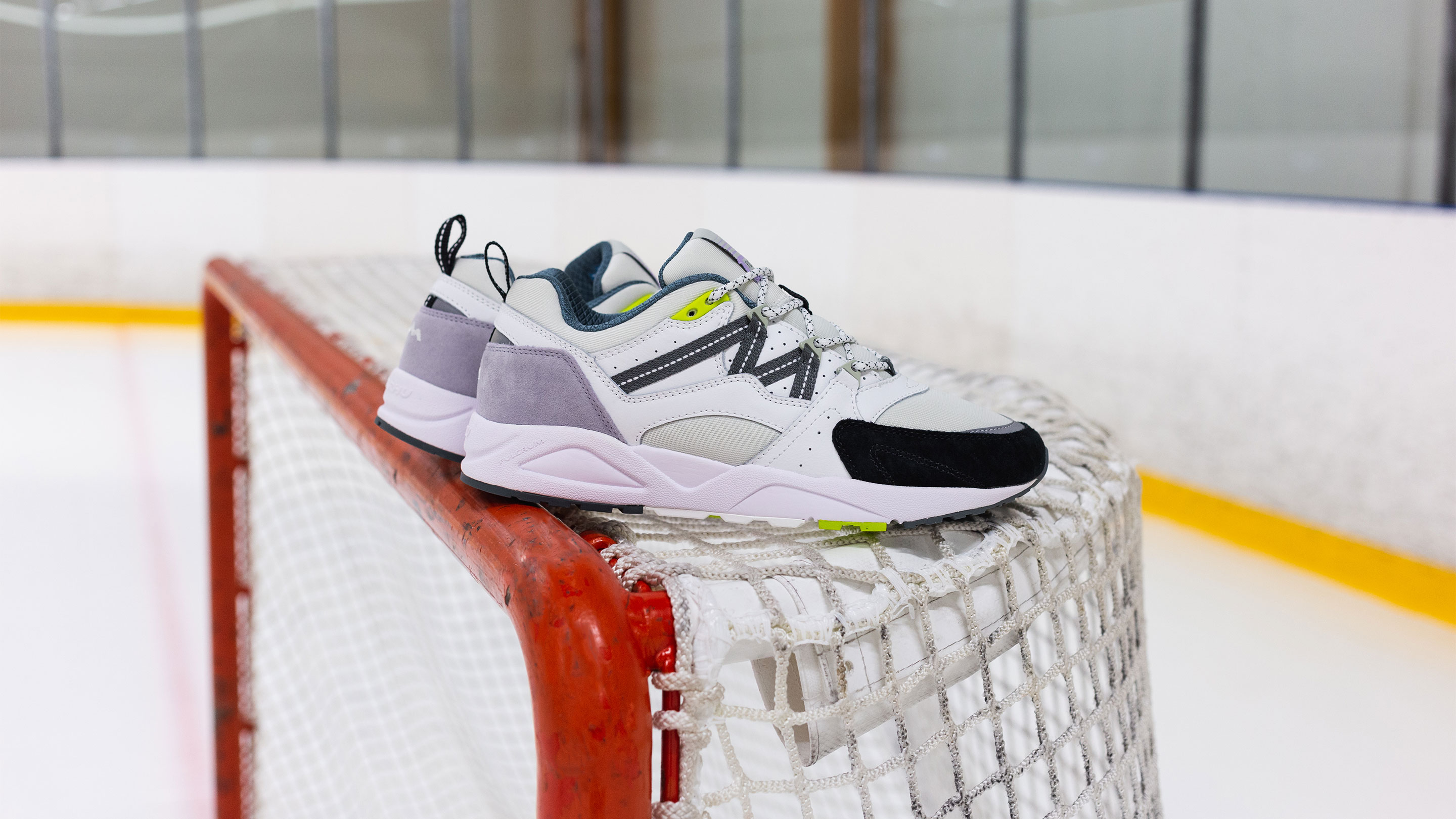
KARHU FUSION 2.0 MEN'S SHOE
KD 47.000
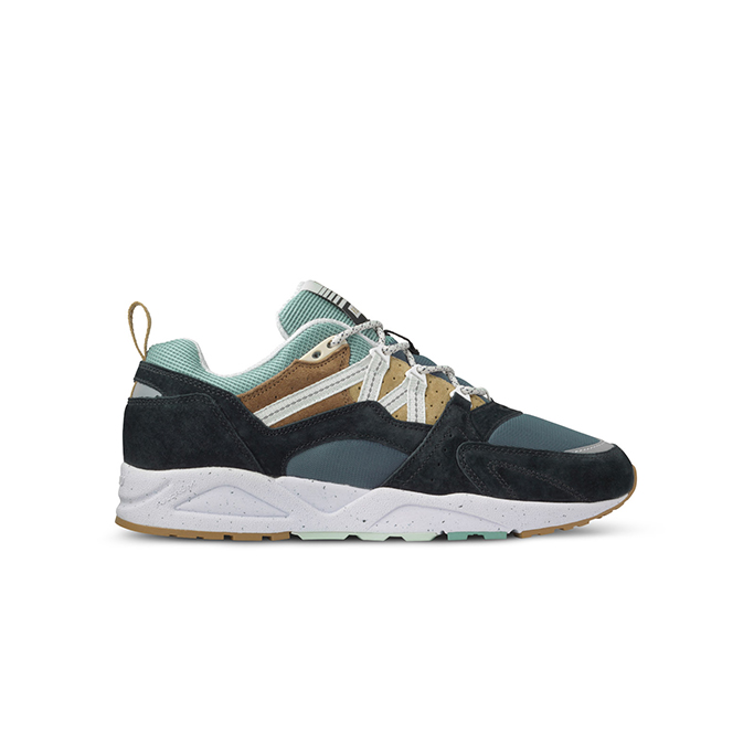
KARHU FUSION 2.0 MEN'S SHOE
KD 47.000
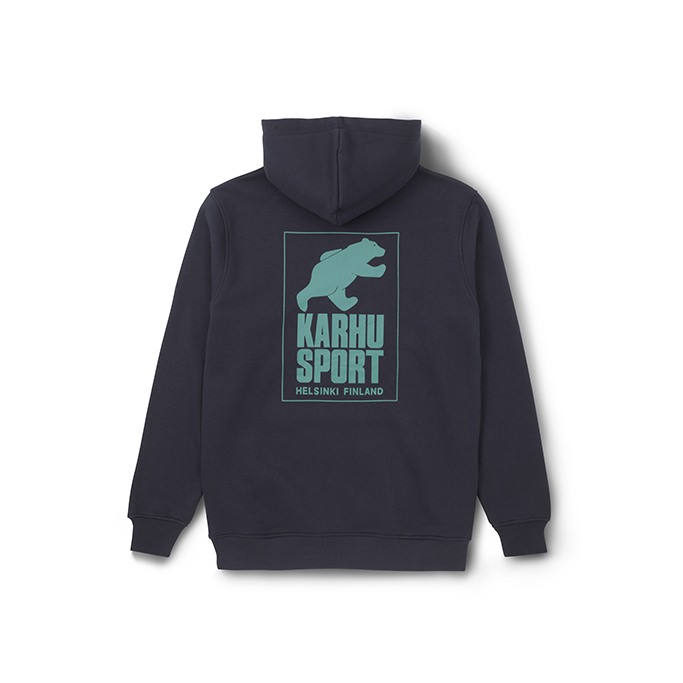
KARHU MEN'S HELSINKI SPORT HOODIE
KD 30.000
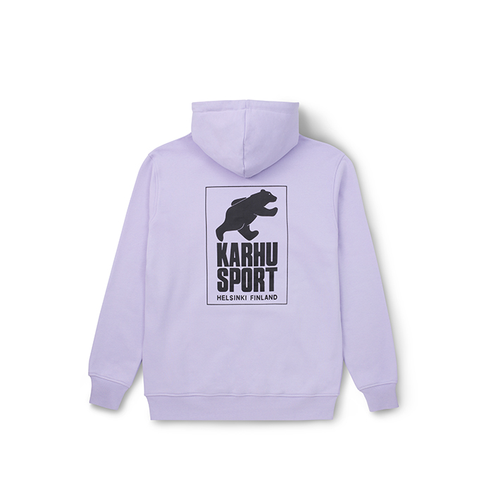
KARHU MEN'S HELSINKI SPORT HOODIE
KD 30.000
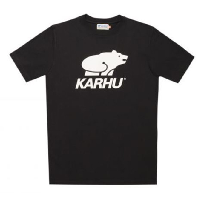
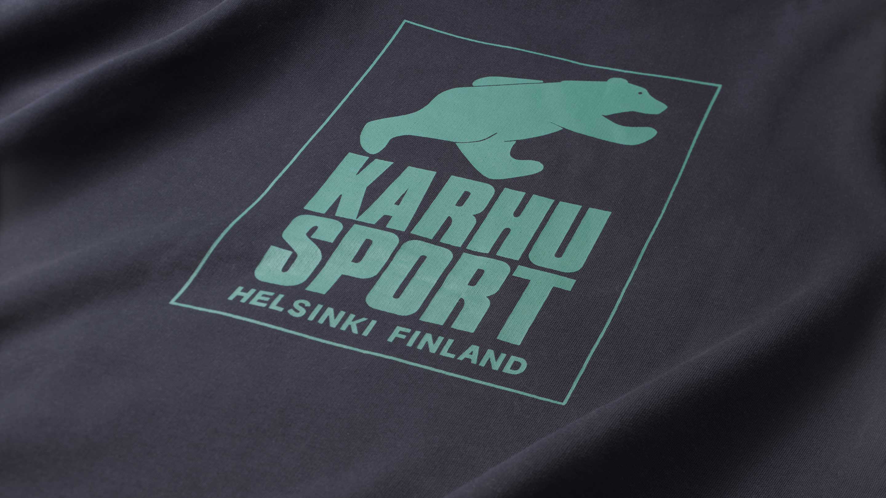
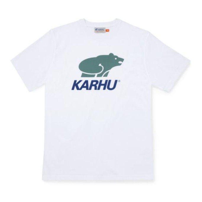
KARHU MEN'S BASIC LOGO T-SHIRT
KD 13.500
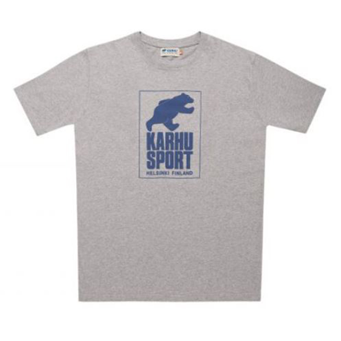
KARHU MEN'S BASIC LOGO T-SHIRT
KD 13.500
KARHU MEN'S BASIC LOGO T-SHIRT
KD 13.500